
How to Design a Poetry Book: Interior Design
- Julie Haase
- 4 days ago
- 9 min read

We’ve talked about how to design a poetry book cover, so now let’s discuss how to design the interior of a poetry book—from front and back matter to the layout of the poems themselves. Chances are you already know what the poems should look like, since you likely made that decision when each poem was written. But how do you position them on the page—along the left margin, along the right margin, or right down the middle?
You also need to have an understanding of how books are set up in general—margins, page numbers, running heads (if you use them), bleed (for interior graphics), and more.
If you have no intention of ever self-publishing a poetry book or designing your own book even if you do self-publish, this information can still be very helpful as you work with a designer or publisher in creating your book, so we suggest reading on no matter what your publishing goals are.
Elements of a Book Interior
You encounter most of these elements whenever you pick up a physical book, but you may not have ever given them much thought. If you’re publishing a book, however, a basic understanding of these elements can be very helpful.
Margins
Book margins are not as cut-and-dried as you might think, because they have to be able to accommodate things like the binding and the headers and footers (for running heads and page numbers). A typical layout for margins looks something like this:

The top, bottom, and outside margins are usually the same width, with extra space at the top and bottom to accommodate space between the headers/footers and the main text area. The inner margin is usually wider to accommodate the binding. The more pages a book has, the harder it is to open it wide, and therefore, the wider the inner margin needs to be.
You can review the margin widths recommended by Amazon KDP to get a better understanding of the difference between inside and outside margins.
Bleed
When you run graphics or color all the way to the cut edge of a printed piece, you have to extend the graphics or color beyond the cut line (usually 1/8") to account for shift on printing presses/finishing machines. If you run the graphics or color up to the edge but don’t bleed beyond that, you can wind up with a white line along the edge of the page (where the graphic/color stops and the paper shows). Adding bleed prevents that from happening.
Most book interiors don’t have graphics or color that requires bleed, and you’re far more likely to deal with bleed on your cover than in your interior, but it’s still a good concept to understand. Should you decide to do so, you wouldn’t be the first person to publish a poetry book that includes graphics that bleed.
Running Heads
Running heads appear at the top of pages and usually include the title of the book on one side and the author name, chapter title, section title, or repeat of the book title on the other side. Some books have these at the bottom of the pages instead, and those are called running feet.
Running heads aren’t required in any book, but they are pretty standard in most fiction and nonfiction books. Their purpose is to help readers navigate the book and know where they are in it, which is an issue that poetry books don’t tend to have. So use them if you want, but don’t feel obligated to include them if you don’t want to.
If you use running heads, note that they are not used on opening pages (like the first pages of chapters, sections, etc.), display pages (like the copyright, dedication, or title page), and blank pages.
Page Numbers
Page numbers are usually placed in one of three places: the top outer corner, the bottom outer corner, or the bottom centered. It’s up to you on which of these spots your page numbers fall. There are two main tricks to page numbers:
Front Matter: Page numbers in front matter are usually lowercase Roman numerals (i, ii, iii,...). The standard Arabic numerals (1, 2, 3,...) don’t start until the introduction or whatever is the first page of the main text, except…
Opening, Display, and Blank Pages: As with running heads, page numbers do not appear on these pages, with one exception: Opening pages can have a page number, but it should always be at the bottom of the page, even if your other page numbers are at the top of the page.
Front Matter
Front matter includes everything that comes before the main text. Standard front matter items include the following, not necessarily in this exact order:
Half title page—includes the title only and is often left out
Full title page—includes title, author, and publisher info
Copyright page—usually on the back of the title page and, at the very least, includes the copyright holder and year (© 2026 Jane Doe), publisher info (if published under the author’s or someone else’s imprint), Library of Congress Control Number (if applicable), and the ISBN's for all versions (paperback, hardback, ebook)
Dedication
Table of contents (TOC)
Preface—written by the author about why they wrote the book, certain types of acknowledgments, resources/research; probably not a good fit for a poetry book
Foreword—written by someone else as an introduction to the author and the work
Introduction—usually appears as part of the main text instead of the front matter; written by the author and is tied more closely to the work, like inspirations, what the work means to the author, explanations to help readers navigate the work, etc.
Acknowledgments (or can be in the back matter)—Notice the spelling. No e after the g is industry standard.
Endorsements—solicited from other poets and creatives or people with a connection to the topic
List of other books/publications by the author
Front matter is not required, not even the copyright page; however, it’s recommended to include at least a title page, copyright page, and TOC. Any other front matter is up to you.
Back Matter
A book of poetry does not require any back matter at all, unless you have sources you need to cite. Here are some of the options for back matter, again in no particular order:
Acknowledgments (if not included in the front matter)
Appendixes
Glossary
Notes (like endnotes)
Bibliography
Illustration/photo/image credits
Index
About the author
Letter to readers
Setting Up Poem Pages
Here’s where poetry books get tricky because simply running all the poems down the left margin isn’t very interesting visually. And what do you do with poems that take more than one page? And how do you build visual continuity from one highly formatted poem to the next?
Personal preference plays a huge role here, and no one can tell you the “right” way to set up your poem pages. Below are some options and the hows, whys, and whens of selecting each one.
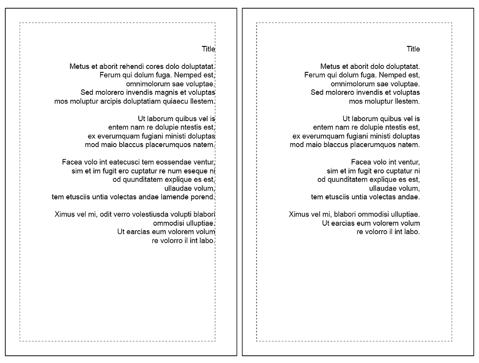
Left Aligned
When you’re using left alignment, you have to decide if you’re going to run the lines down the left margin of the page or if you’re going to center the poem on the page. Using the left margin is easy. Centering, which is the traditional way (and my personal preference) to set up a left-aligned poem, is harder.

When you center a left-aligned poem on the page, first you center the longest line, then you line up the rest of the poem to that longest line. This can lead to the poem looking really off-center, especially if you have just a few lines that are significantly longer than the rest of them. Then again, aligning along the margin can look odd, too, if your poems have really short lines (lots of open white space!). Generally speaking, it's best to be consistent in your formatting, but hey, if you have some poems that look better in the center of the page and some that look better along the margin, who's to say you can't use both options?
One issue with left alignment comes up when you have lines that are too long to fit. You don’t want the line to just wrap around and look like another separate line, right? Notice in the left-hand example above how the third line from the bottom is indented? That’s how you handle wrap-around. You set what’s called a “hanging” indent, which basically means you’re indenting the paragraph but pushing the first line back to the margin. Therefore, the first line starts at the margin, but subsequent lines that wrap around get indented.
Centered
Center alignment is pretty straightforward and not particularly tricky. The only real question is what to do with lines that don’t fit. You may have to make some decisions about how/where to split longer lines into two because you don’t really want those lines to just wrap around. That can look really weird, especially if the part that wraps is super short. Plus, you really want to be in control of where each line breaks. It’s poetry, after all!

Notice the one-word line in the last stanza? That’s from wrap-around and that, plus the very long line above it, looks a bit haphazard, yes? It's better to be deliberate about where long lines break.
Right Aligned
This is kind of a cool way to set up your poems and is often used in conjunction with left alignment—left-hand pages are left aligned and right-hand pages are right aligned.
With right alignment, you still need to decide if you’re going to follow the margin or center the poem on the page. And you still need to figure out what to do with long lines that don’t fit. The wrap-around option described above for left alignment doesn’t really work with right alignment. So you’ll probably have to just split up long lines, similar to when using center alignment.
Titles
Regardless of the alignment you choose, you have to decide how to set up your titles. They can follow the alignment option—or not! In other words, your titles can be left/right aligned while your poems are centered, or vice versa. Maybe you want all your titles to align to the outer margins. Or maybe you want all your titles centered. Or perhaps you want all your titles to be vertical or inserted halfway down each poem or backward at the bottom of the page! There are really no rules! My only recommendation is that you set up your titles consistently so your readers can follow what’s going on (and backward is probably not a good idea!).

Oh, and despite what’s shown in these examples, note that the title doesn’t have to align to the top of the text area. It can appear partway down the page, like in the alignment examples above.
Long Poems
Once you’ve positioned your titles and decided on your alignment, you have to figure out how to handle poems that don’t fit on one page. Here are some points to consider:
You can let the poem continue from the top of the next page, or you can have it continue in alignment with the first line of the poem (so, for example, if the first line of the poem is an inch down, the next page starts an inch down). See the example below.
If you’re doing left-aligned on left pages and right aligned on right pages, you can still follow that formatting, even though it may seem odd to use different formatting for the same poem.
Try to prevent having just one or two lines of a poem wrapping around to the next page. This can be difficult to avoid and may require some creative line spacing, but if at all possible, try to have at least three lines to a page (two at the bare minimum—never just one!).
Also try to set up two-page poems on facing pages (so the poem starts on a left page and ends on a right page) to keep the whole poem together.

Conclusion
Laying out the interior of a poetry book can be challenging, especially with poems that have intricate formatting with lots of indents and short stanzas. Converting those books to ebooks is even more challenging (please promise to hire a professional to do that for you!). But with care and diligence, you can do the layout yourself if you so choose. Just take your time doing it. There’s no reason to rush the process, and if you’re laying out a book for the first time, you need to give yourself the opportunity to learn how to do it.
Poetry layouts offer a lot of variations, and you can be quite creative in how you do it, but you still need to do it well. The last thing you want is for your self-formatted book to look like it was laid out by an amateur—even if you are an amateur! You want to publish a book that looks like it was designed by a seasoned expert, and that means good software (don’t use Word!), learning, trying, more learning, more trying, and plenty of patience.
And if this article completely turns you off of designing your own book, that’s OK (and probably for the best, if only for your sanity!). Find a layout designer with lots of experience laying out poetry books. Look at examples of their work to ensure you like what they do. And for goodness sake, don’t settle! Your book deserves to be beautiful and professional, so whether you do the layout or you hire someone else to do it, be sure it gets done well.
